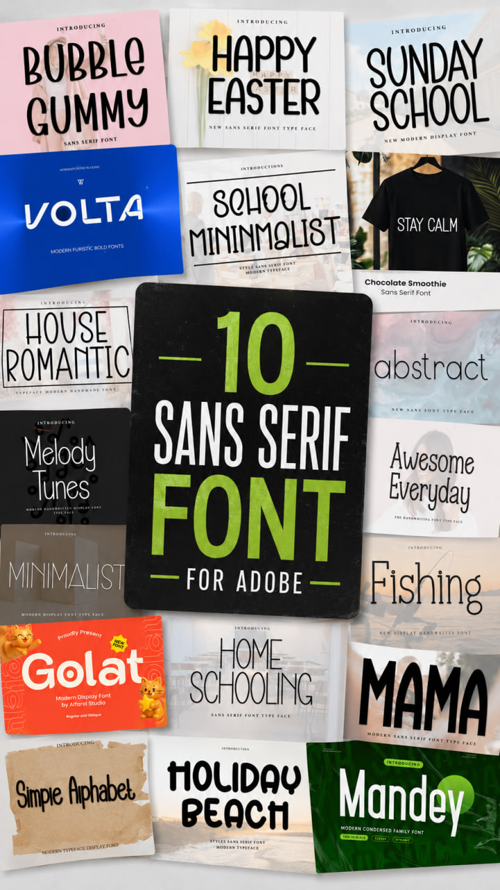
16 top vintage display fonts
There’s something magnetic about the aesthetics of the past. As a designer, I’ve always felt that a well-chosen display font is the fastest way to transport an audience to another era, setting a mood before a single word is read.
Lately, I’ve been experimenting with how nostalgic styles—from groovy 70s curves to gritty varsity textures—can breathe life into modern layouts. I’ve curated this list of 16 top vintage display fonts that have become essentials in my design kit. While I didn’t create these myself, they are my go-to picks for adding an authentic, soulful touch to any project. Let’s dive in!
Back to Vintage display Font


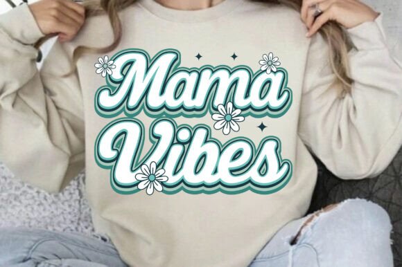
I have been feeling particularly inspired by the aesthetics of the 60s, 70s, and 80s lately, and this display Font is the perfect way to channel that energy. Back to Vintage is a beautiful typeface that takes classic retro typography and gives it a modern, approachable twist. As a designer, I love how every corner of the letterforms is softer and more rounded, creating a unique shape that instantly grabs attention without feeling too harsh.

Using this display Font is such an easy way to add a special retro touch to almost any design idea you can think of. Whether I’m working on a bold poster or a nostalgic brand identity, anything written in this typeface becomes instantly recognizable. It’s a fantastic tool to have in your kit when you want to capture that vintage soul while keeping your layout looking clean and professional.
Vintage Western Display Font

When I’m working on a project that needs a bit of grit and soul, this display Font is exactly what I reach for. The Vintage Western Special Grunge is a bold, rugged typeface that feels like it was pulled straight off an old-west saloon sign. As a designer, I’m really impressed by how the strong slab-style letterforms pair with that distressed grunge texture to deliver an authentic cowboy aesthetic.

I’ve found this display Font to be incredibly versatile for anything from western-themed branding and logos to t-shirt prints and rustic packaging. Its rough texture and bold character make it a go-to choice for creating eye-catching headlines that demand attention. Whether you are designing a vintage poster or a retro label, this font adds that perfect layer of rugged history to your graphic projects.
Vintage King display Font

There is something undeniably powerful about a typeface that can carry a whole design on its own, and this display Font does exactly that. Vintage King is a retro, bold choice that brings an immediate sense of weight and character to the page. As someone who loves playing with typography, I really appreciate that it’s PUA encoded; it makes my workflow so much smoother since I can access all those gorgeous glyphs and swashes without any technical headaches.

In my experience, this display Font is an absolute powerhouse for headlines and magazine layouts where you need the text to feel substantial. It also works incredibly well for logos and branding projects that require a touch of vintage flair. Whether you’re looking to make a statement on a cover or build a memorable brand identity, Vintage King offers that perfect blend of nostalgic style and modern ease of use.
Vintage Bohemian Display Font


I’m always on the hunt for typefaces that feel a bit more “alive,” and this display Font is a perfect example of why I love unique typography. Vintage Bohemian is bold and cheerful, but what really stands out to me as a designer is its light, airy nature combined with those distinct, creative characters. It’s the kind of typeface that doesn’t just sit on the page—it actually adds a specific mood to the entire layout.

I’ve found that having this display Font in my library is a total game-changer for those projects where I want to express a more fun, artistic side. Whether I’m working on a vibrant social media campaign or a playful brand identity, its unique personality helps bring creative design ideas to life effortlessly. If you want your text to feel both stylish and high-spirited, this is definitely one you’ll want to experiment with.
Vintage Varsity Display Font
If you’re anything like me, you know that finding the right display font can completely change the energy of a project. Lately, I’ve been obsessed with the “old-school cool” look, which is why I’m currently leaning into the Vintage Varsity display font aesthetic. It’s a bold, distressed athletic typeface that feels like it was pulled straight off a 1970s college championship sweatshirt.


I love using this style because it brings a rugged, grunge texture to a classic varsity structure, making it a go-to for sports branding, custom t-shirts, or high-energy posters. Whether I’m working on a team logo for a local league or just playing around with motivational gym apparel, this font delivers a confident, worn-in look that feels authentic rather than “perfect.”
Stay Vintage Display Font
When I’m hunting for the perfect display font to anchor a new project, I usually look for something that balances personality with sheer readability. Lately, I’ve been completely charmed by the Stay Vintage display font. It has this playful, wavy structure that feels like a trip to a 70s candy store, mixing a breezy summer aesthetic with a touch of boho-chic. It’s the kind of typeface that doesn’t just sit on the page—it actually breathes life into branding, whether I’m working on funky stickers or eye-catching YouTube thumbnails.


What really draws me to this style as a designer is its incredible flexibility. It’s got that groovy, psychedelic energy for “bold” concepts, yet it feels surprisingly at home in sleek, modern layouts too. I’ve found it particularly effective for children’s packaging and digital planners because it’s “cute” without losing its professional edge. Plus, with all the alternates and ligatures included, it’s easy to customize a logo so it feels truly unique. From printable SVG projects to global digital designs, this font is a reminder that the best parts of retro design are definitely trending again.
Vintage Noise Vintage Font
There is something incredibly satisfying about breaking away from “pixel-perfect” designs and leaning into something more raw. When I need to add some serious attitude to a project, I find myself reaching for a textured display font that can carry the weight of an entire layout. That is exactly what Vintage Noise brings to the table. It’s a bold, distressed typeface that captures that industrial, urban poster vibe perfectly. With its rough grunge effect, it feels less like a digital file and more like a tactile piece of history—like fresh ink stamped onto a weathered piece of paper.


I love using this specific style for rock band posters, streetwear branding, or moody social media graphics where “clean and corporate” just won’t cut it. The beauty of the Vintage Noise display font is that even with all that gritty texture and “noise,” the letterforms stay remarkably readable. It pairs like a dream with halftone patterns and dark color palettes, giving my designs an authentic, worn-in soul that’s hard to replicate. If you’re looking to give your logos or merchandise a strong, impactful visual presence that refuses to be ignored, this is the aesthetic to go for.
Brolin Vintage Display Font
Sometimes a project just calls for a little extra dimension and a lot of personality. When I’m aiming for that perfect balance between “cute” and “classic,” I love experimenting with a bold display font that doesn’t take itself too seriously. That’s where Brolin Vintage really shines in my workflow. It’s a playful, retro-inspired typeface that manages to blend nostalgia with a fresh, modern charm. The standout feature for me is definitely those smooth curves paired with a layered 3D effect—it makes every headline literally pop off the screen or the page.
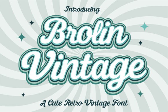
I’ve found that using the Brolin Vintage display font is a total game-changer for T-shirt prints, stickers, and social media graphics that need to feel warm and inviting. It has this stylish, high-energy vibe that reminds me of vintage signage but with a polished finish. Whether I’m designing a fun logo or a bold poster, this font brings a specific kind of “retro flair” that feels both trendy and timeless. It’s one of those creative tools that instantly injects a sense of fun into any design adventure I’m currently embarking on.
Fresco Vintage Duo Display Font
One of the biggest challenges I face as a designer is finding two typefaces that actually play well together without clashing. That’s why I’ve been reaching for the Fresco Vintage display font duo so often lately. Created by Creacy Studio, this set is a dream come true for anyone who loves that mid-century aesthetic. It perfectly captures the vibe of old-school grocery signage and coastal diners, pairing a bold, geometric sans-serif with an effortlessly smooth script. It’s that “weighty assertion” meets “playful rhythm” that makes a layout feel instantly professional and thoughtfully curated.


I’ve found that using this specific display font combination is a total “cheat code” for retro packaging and branding projects. The Sans version is my go-to for striking headlines on juice packets or restaurant menus, while the Script adds a personal, hand-lettered touch to taglines and social media quotes. Because it includes a subtle texture and extensive multilingual support, it feels like an authentic piece of history rather than a flat digital imitation. Whether I’m working on a vintage poster or a modern café’s visual identity, this duo brings a breezy, summertime charm that makes every design feel a bit more memorable.
Retro Vintage Display Font
Whenever I’m working on a project that needs a personal, handcrafted touch, I find myself looking for a display font that feels more like a signature than a typeface. That is exactly why I’ve been so drawn to the Retro Vintage script lately. It’s a beautiful, vintage-style handwritten font that feels like a direct throwback to mid-century elegance. There is a certain “classic charm” in its flowing lines that you just can’t get from a standard sans-serif, making it an incredible choice for logos, stationery, or high-end branding that needs to feel sophisticated yet approachable.


In my own design workflow, I’ve found this display font to be a lifesaver for wedding invitations and social media posts where the goal is to create an emotional connection. It captures that timeless typography look perfectly, adding a layer of nostalgia to every letter. Whether I’m building out a brand identity or just designing a custom greeting card, the Retro Vintage script provides that “hand-inked” authenticity that truly stands out in a crowded digital world. It’s all about bringing a bit of the past into our modern creative projects.
Vintage Survive display Font
When a project calls for a look that is both weathered and unbreakable, I find that a standard typeface just won’t cut it—I need a display font with some serious grit. That’s exactly why I’ve been experimenting with Vintage Survive. It is an ultra-bold, grunge-style font that feels like it has actually lived through something. With its heavy, blocky structure and intentional distressing, it brings a “survival” edge to the canvas that is perfect for when you want your design to feel raw, resilient, and unapologetically loud.


I personally love using this display font for high-impact visuals like extreme sports branding or vintage military-inspired layouts. Because the texture is built right into the letterforms, it saves me so much time on post-processing; the “worn-out” look is already there, giving off a strong nostalgic vibe. Whether I’m mocking up an album cover or a bold movie title, Vintage Survive provides that aggressive, tactile presence that ensures the message doesn’t just sit on the page—it commands attention.
Retro Script Display Font
Sometimes, a project needs more than just bold letters; it needs a soul. When I’m looking to inject a bit of warmth and human connection into my work, I find that a handwritten display font is the absolute best way to do it. Lately, I’ve been reaching for Retro Script to give my designs that “special something.” It’s a cool, vintage-inspired typeface that flows beautifully, making it my top pick for everything from elegant wedding stationery and invitations to chic social media posts that need to feel authentic and inviting.

What makes this specific display font a permanent resident in my design toolkit is how user-friendly it is. Since it’s PUA encoded, I can easily play around with all the extra glyphs and swashes without any technical headaches—which is a huge plus when I’m trying to customize a logo or branding project for a client. Whether I’m designing a nostalgic brand identity or just some stylish stationery, Retro Script adds a layer of classic charm that instantly elevates the entire aesthetic. It’s all about those graceful, hand-drawn lines that remind us why vintage style never truly goes out of fashion.
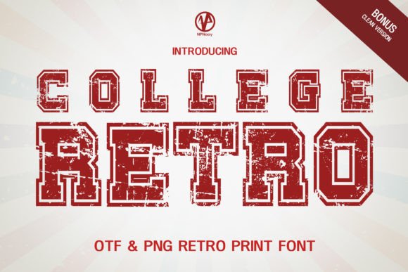
College Retro Display Font
Whenever I’m scouring my library for something with a bit of “soul,” I find myself reaching for College Retro. As a designer, I’ve found that the right display font can carry the entire weight of a project, and this one brings that perfect vintage, grunge-distressed aesthetic that feels genuinely lived-in. It’s not just about the letters; it’s about that raw, athletic energy that manages to brighten up even the most minimal layouts. I’ve started adding it more confidently to my personal projects lately—whether it’s for a quick social media graphic or a deeper branding concept—and honestly, the results speak for themselves. If you’re looking to inject some character into your work, this is one display font you’re going to absolutely love.

70s Vibes Display Font
Lately, I’ve been leaning heavily into that groovy, nostalgic aesthetic, and the 70s Vibes typeface has become a total staple in my workflow. As a designer, I’m always looking for a display font that doesn’t just sit there but actually brings a specific energy to the canvas. This font is incredibly cool—it captures that thick, curvy boldness that defined an era while still feeling fresh for modern use.


I’ve been experimenting with it across various projects, from custom posters to some experimental DIY crafts I’ve been working on at home. It’s the kind of display font that’s an amazing choice whenever you need a bold touch that demands attention without being overbearing. Honestly, if you start adding it confidently to your creations, you’re going to fall in love with the results just as much as I have.
Lucky Chunks Display Font
I’ve been spending a lot of time lately exploring 70s-inspired aesthetics, and I have to say, finding the Lucky Chunks typeface felt like hitting the creative jackpot. As a designer, I’m always on the hunt for a display font that can anchor a project with both weight and warmth, and this one delivers that nostalgic, handmade feel perfectly. Its bold, chunky shapes and soft rounded curves bring an instantly cheerful spirit to any canvas I drop it onto.


I’ve found it’s incredibly versatile for my personal experiments—whether I’m mocking up some funky packaging, designing a few stickers, or working on social media graphics that need a bit more personality. It’s that rare kind of display font that feels both expressive and professional, making it my go-to for everything from boho-themed branding to eye-catching headlines. If you want to give your work a standout look with a timeless retro soul, you definitely need to give this one a try; it adds that friendly, standout charm almost effortlessly.
Outrech Brigend Display Font
I’ve recently been obsessed with the liquid-like, psychedelic aesthetics of the 60s and 70s, and finding Outrech Brigend felt like uncovering a hidden gem in a vintage record shop. As a designer, I’m always looking for a display font that can act as the centerpiece of a layout rather than just supporting text. This typeface captures that vibrant, groovy energy perfectly with its heavy weight and undulating, almost melting forms. It has this incredible playful rhythm that makes every word feel like it’s pulsing with life.


In my recent projects, I’ve been playing around with it for some creative editorial work and artistic posters, and the high-impact look it provides is unmatched. Between the soft, rounded terminals and the unique ligature styles, it’s a display font that gives me so much room to be expressive. Whether you’re working on bold branding or just want to inject some retro pop culture vibes into your latest project, this font ensures a standout look that’s both nostalgic and incredibly fresh.
Still Looking for the Perfect Match?
If you haven’t found the right fit yet, don’t worry—I have plenty of other collections right here on my blog. You can also explore a massive variety of high-quality styles over on my partner’s site to find exactly what you need.
- Check out more of my favorite vintage display fonts here
- Browse even more unique display fonts on my partner’s site