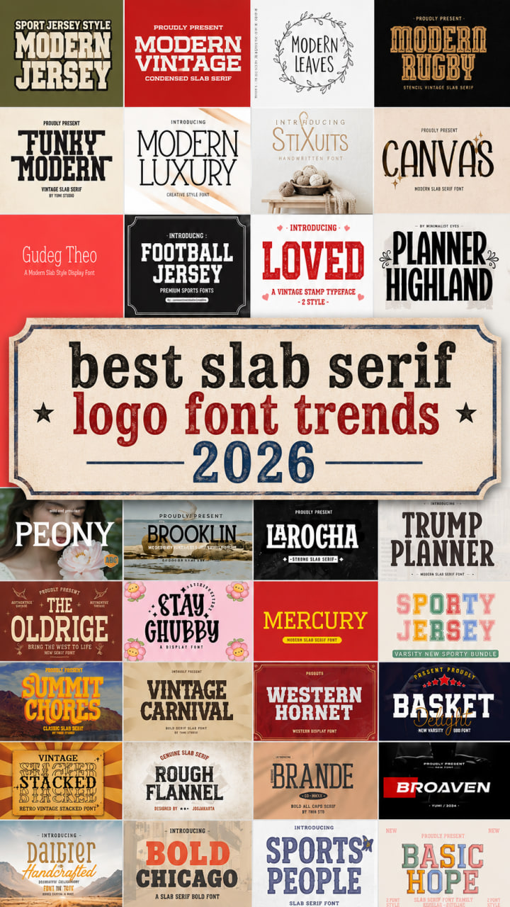
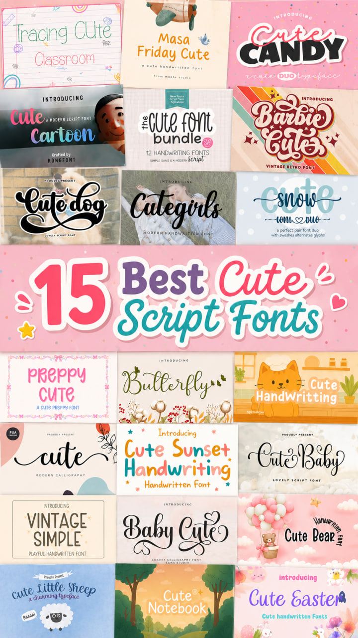
14 Best Adobe Logos Fonts to Use in 2026: Modern Trends & Classics
Entering 2026, I’ve noticed a major shift in how we approach brand identity—design is no longer just about looking “new,” it’s about feeling intentional and human. As I refresh my own creative toolkit this year, I’ve realized that the right adobe logos fonts are the ones that balance this new-age “Neo-Minimalism” with a touch of organic warmth. We are moving away from clinical, cold layouts toward typography that tells a story, whether it’s through a gritty, handcrafted script or a refined, high-contrast serif. In this list, I’ve curated 14 of my absolute favorite fonts available on Adobe that perfectly capture this 2026 aesthetic, blending timeless classics that never fail with the bold, expressive faces that are currently defining the future of branding.
Growthness Font

When I first came across Growthness, I was immediately struck by its raw, organic energy. As someone who constantly hunts for the perfect script logo fonts to bring a brand to life, I find that this typeface hits that rare sweet spot between professional design and effortless, hand-drawn character. It doesn’t feel like a digital imitation; it feels like real ink meeting paper, which is exactly the vibe you want for high-end fashion, moody movie posters, or a signature logo that needs to feel personal.
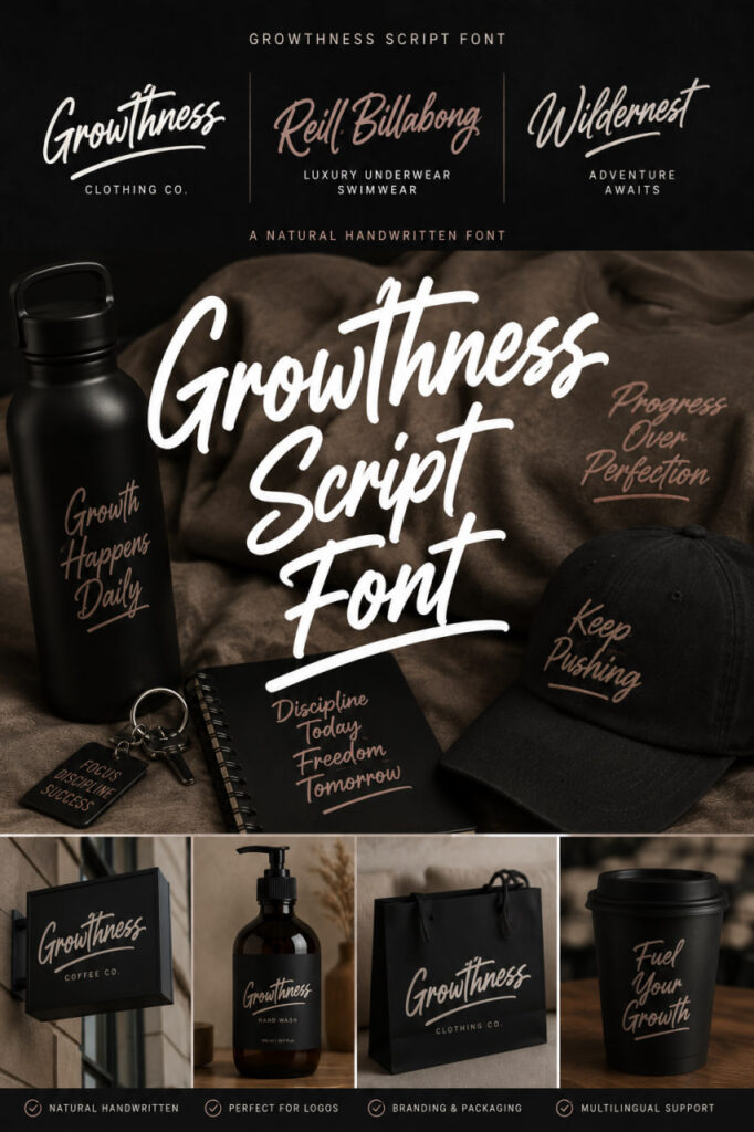
What really sets Growthness apart for me is the “Natural Rough” texture. It gives the letters a tactile quality that works beautifully on everything from apparel to blog headers. Beyond the aesthetics, it’s a powerhouse for customization—it includes a full range of PUA Unicode characters, stylistic alternates, and contextual variants. This means when I’m using it for a script logo font project, I can tweak the ligatures and symbols to ensure the final result looks unique and perfectly balanced. Whether you’re working on a minimalist name card or a bold art poster, this font provides that authentic, “human” touch that standard scripts often miss.
British Columbia Family Font
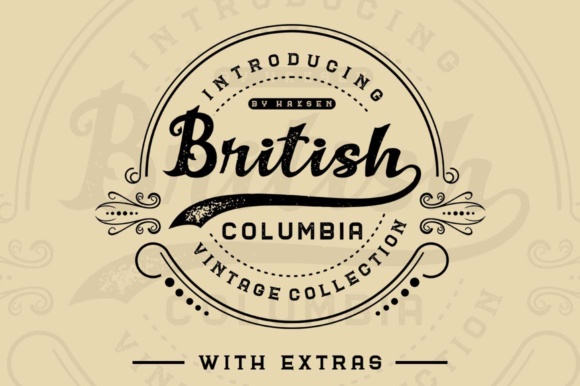
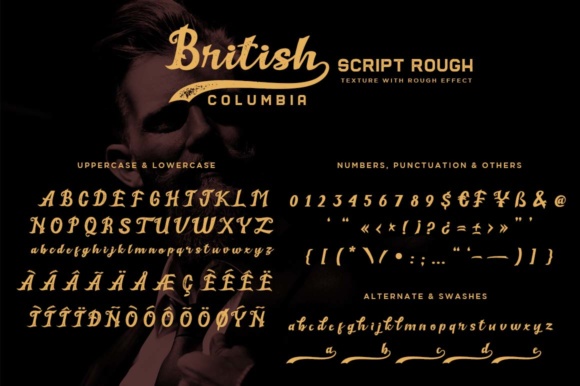
There is something deeply nostalgic about the weathered textures of old-school masonry, and the British Columbia Collection captures that spirit perfectly. When I’m scouting for logo fonts and rustic display faces to anchor a project, I look for versatility, and this set delivers exactly that with its “Rough” and “Solid” weights. Inspired by the timeless aesthetic of vintage brick wall murals, these fonts bring an immediate sense of history and craftsmanship to any canvas.

The collection is surprisingly versatile, offering three different fonts each available in “Rough” and “Solid” weights. While I often lean toward serif logo fonts for elegance, I love pairing them with a sturdy serif like this to ground the design. It’s a perfect match for branding or packaging that needs a handcrafted, authentic vibe. Plus, the fact that it comes with 15 editable logo templates for Illustrator makes the workflow so much smoother—it’s like having a head start on a vintage title design without having to build the foundation from scratch.
Allover Modern Font


When I’m brainstorming brand identities, I often find myself looking for that perfect balance between high-fashion sophistication and modern edge. Allover Modern is exactly that—an elegant serif that commands attention with its bold lettering and those incredibly unique decorative details on every character. While my go-to for many creative projects involves hunting down fluid script logo fonts, I’ve found that a strong serif like this acts as the perfect anchor, providing a high-contrast look that feels both timeless and trendy.
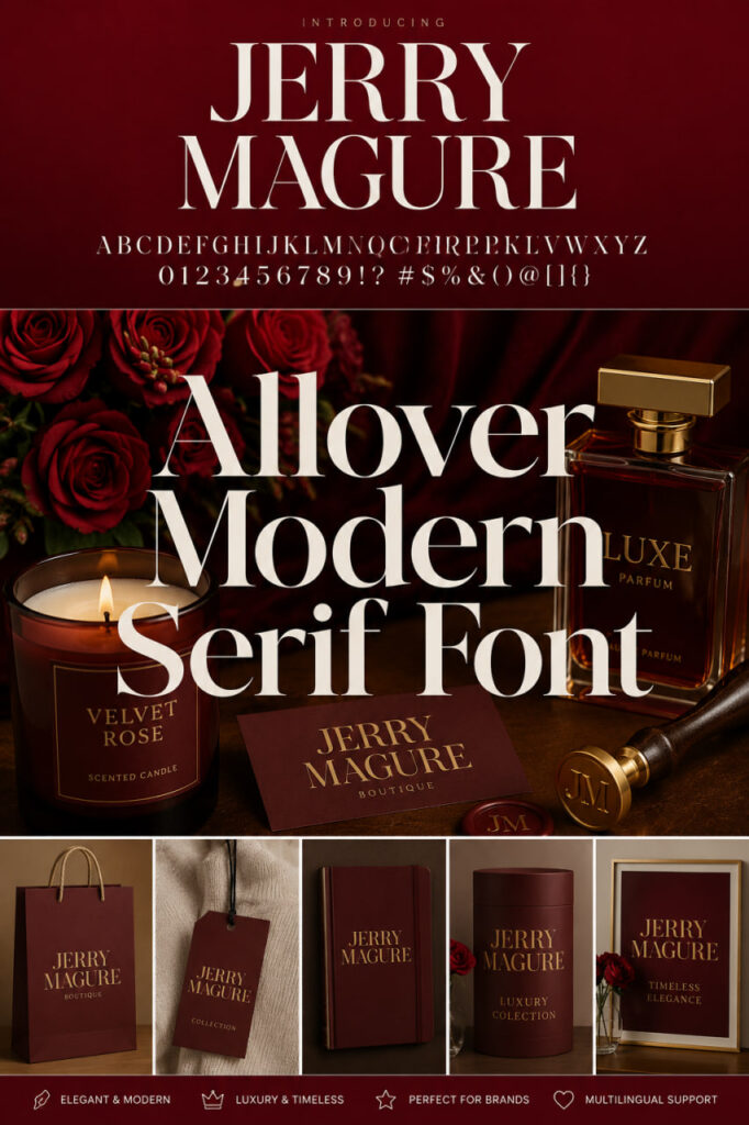
What I love most about this typeface is its sheer versatility. Whether I’m mocking up a minimalist magazine header or a complex product packaging layout, it holds its integrity beautifully at any scale. It’s a fantastic alternative or companion to serif logo fonts when you want to achieve a “luxury brand” aesthetic. From stylish text overlays to full-scale branding projects, Allover Modern adds a polished, curated feel that makes any design look like it belongs on the streets of Milan or the pages of a premium editorial.
Montern Font

There is an unmistakable “old-school cool” that comes with a typeface like Montern, and it’s the kind of discovery that makes me love being a designer. When I’m scouting for script logo fonts to use in a project, I often look for a strong, vintage companion to balance out those fluid curves, and Montern is the perfect rugged counterpart. It carries a heavy, rustic charm that feels like it was pulled straight off a 1950s barbershop window or a classic coffee tin, making it a total game-changer for niche branding like craft pomades or boutique brewery labels. While elegant script logo fonts bring the flair, Montern provides the grit and authentic “wild” energy needed for a memorable logotype, adding a layer of history and character to any poster or branding layout I work on.
Rock Away Font
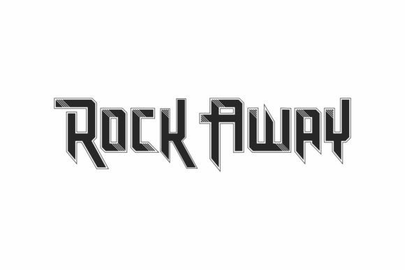

Whenever I’m searching for script logo fonts that can actually hold their own in a heavy-duty layout, Rock Away always catches my eye because it brings a level of strength and readability that’s hard to find. It’s one of those reliable tools I keep in my kit for branding and printed materials where I need a design to look bold without sacrificing clarity. I love the fact that the uppercase and lowercase characters are designed to be similar but not identical, giving it a custom, hand-touched feel that works perfectly for packaging or punchy quotes. Since it’s fully compatible with my daily Adobe workflow and supports multilingual characters, it’s a seamless choice when I want to step away from traditional script logo fonts and go for something with a bit more grit and visual impact.
Coroy Font
Whenever I’m scrolling through my collection of script logo fonts looking for that perfect high-contrast pairing, Coroy is a typeface I constantly find myself returning to for its effortless minimalism. Inspired by some of the most iconic, clean-cut logos out there, this font brings a level of sophistication that is absolutely essential for modern advertising and beauty design. I’ve found that while script logo fonts provide the personality and movement in a brand, a sleek sans like Coroy acts as the perfect anchor for brochures, invitations, and elegant layouts. It has this incredible ability to make a design look expensive and curated without being over-the-top, making it my go-to choice when I need a layout to feel both breathable and professional.


Grafing Font


When I’m looking to elevate a brand’s visual identity beyond the typical aesthetic, I often find that pairing script logo fonts with a high-end serif like Grafing creates an unbeatable sense of luxury. Inspired by iconic minimalist logos, this typeface brings a level of refinement that’s absolutely perfect for everything from beauty design to editorial layouts. I personally love using it in advertising branding and brochures because it feels incredibly polished and intentional, offering a sharp, clean contrast to the more fluid lines of script logo fonts. Whether I’m working on an elegant invitation or a sophisticated video overlay, Grafing provides that “expensive” feel that makes a minimalist design truly stand out.
Beatford Font


When I’m diving into a project that requires a heavy dose of nostalgia, Beatford is one of those vintage gems I love to pull out of my toolkit. It brings that raw, old-rustic charm that feels incredibly authentic, making it a fantastic choice for anyone moving away from traditional script logo fonts in search of something with more “grit.” I often find myself recommending it for product logos—think artisanal coffee bags or a classic barber shop identity—because it has this organic, wild energy that modern, sterile fonts just can’t replicate. While I frequently use script logo fonts to add elegance, pairing them with a sturdy, retro serif like Beatford creates a balanced, handcrafted look that’s perfect for everything from rugged packaging labels to bold, character-filled posters.
Welmock Font


There is something truly enchanting about Welmock that immediately transports me to a world of vintage royal aesthetics and high fantasy. As a designer, I’m always on the lookout for typefaces that offer more than just standard shapes, and Welmock’s modified ornaments provide a decorative beauty that feels both classic and refreshed. While I often spend hours browsing through various script logo fonts to find that perfect “signature” look, I’ve found that Welmock serves as an incredible anchor for book titles, movie posters, or social media branding. It actually shines brightest when you lean into that contrast; combining its regal serif structure with fluid script logo fonts creates a sophisticated, multi-layered design that feels custom-made for any high-end project.
Qastic Estoda Font


When I’m looking for a typeface that screams “luxury boutique,” Qastic Estoda is usually at the top of my list. It’s a stylish ligature typeface that carries that unmistakable minimalist vibe found in high-end fashion logos. In my design work, I’ve found that while script logo fonts are amazing for adding a personal, hand-lettered touch, a sophisticated serif like this one provides the structural elegance needed to make a brand feel established. The way the ligatures flow makes it feel custom-crafted, which is perfect when I’m designing sleek brochures or modern advertising campaigns. It’s a fantastic alternative or companion to traditional script logo fonts for any designer aiming to create a logo that looks both timeless and incredibly chic.
Radien Brush Font
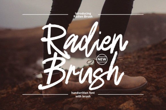

If you are looking for a typeface that radiates pure personality, Radien Brush is a total standout in my current rotation. Whenever I’m tired of the same old clinical layouts and want to inject some raw energy into a project, I reach for this font because it functions so beautifully as a bold logo or a striking headline. While I often explore different script logo fonts to find that perfect flow, the brush-stroke texture here offers a gritty, handcrafted alternative that feels incredibly alive. What makes it a dream for my design workflow are the OpenType features; having access to stylistic alternates and ligatures means I can customize the “insignia” look to ensure no two designs feel the same. It’s the perfect choice when you want the impact of script logo fonts but with a more aggressive, artistic edge for packaging or posters.
Lemonade Fresh Font

What immediately drew me to Lemonade Fresh was its playful yet sophisticated departure from traditional serif structures. It’s a display typeface that takes those unique, circular alternate shapes we usually see hidden in OpenType menus and brings them front and center as the main event. In my own branding experiments, I’ve found that while script logo fonts are often the go-to for adding flair, Lemonade Fresh offers a refreshing alternative with its moderate contrast and over 50 alternates that let you “draw” with typography in seconds. It’s incredibly legible, making it a versatile workhorse for everything from wedding invitations to high-impact advertisements. Whether I’m working on a watermark for a photography project or a bold product label, this font provides those beautiful curves you’d expect from script logo fonts but with the grounded, premium feel of a modern serif.
Cozy Rustic Font


When I’m looking to step away from the polished, digital look and give a project some real soul, Cozy Rustic is exactly where I turn. It’s an authentic brush font with a rough, weathered texture that actually reminds me of natural wood grain—perfect for industries like carpentry, craft, or even organic farming. While I spend a lot of time analyzing different script logo fonts for their elegance, I love how Cozy Rustic offers a different kind of handcrafted appeal that feels warm and grounded. It’s incredibly easy to read despite its raw edge, making it a fantastic choice for billboards, product labels, or apparel branding where you want a classic, “awesome” touch. Whether you’re pairing it with script logo fonts for a balanced composition or letting it stand alone on a product package, this font brings that cozy, lived-in vibe that feels both personal and professional.
Polenta Font


When I’m looking to achieve that ultra-clean, high-end aesthetic, Polenta is a typeface that immediately comes to mind. Inspired by the sharp minimalism of world-famous logos, it brings a polished clarity to any project, whether it’s a sophisticated beauty brand or a sleek corporate brochure. In my own design process, I’ve noticed that while script logo fonts are incredible for adding a touch of personality and flow, a steady sans-serif like Polenta provides the essential structural balance that makes a layout feel expensive. It’s my go-to for elegant crafting and advertising branding because it’s remarkably versatile—it works just as well in a minimalist invitation as it does in a bold video title. For anyone looking to pair their script logo fonts with something that exudes modern professionalism, Polenta is an absolute staple for a clean, minimalist finish.
Silvia Font


Finding the right balance between hand-drawn charm and digital precision is a common struggle when browsing script logo fonts, but Silvia manages to bridge that gap perfectly. What I love about this bold script is the choice between its “Clean” and “Textured” styles; it gives me the flexibility to go for a sharp, modern look or a more weathered, classic vibe depending on the project. It’s clear that a lot of effort went into the hand-made strokes and computer-generated refinements, making it a professional-grade choice for anything from t-shirt apparel to high-end magazine headers. While many script logo fonts can feel a bit thin, Silvia’s bold presence and beautiful condensed spacing make it a standout for digital lettering art and logotypes that need to feel both vintage and authoritative. Whether I’m designing a retro sign or a contemporary advertising piece, this font adds that authentic “human” touch that makes any brand identity feel instantly more classic.
Still Haven’t Found the Perfect Match?
Choosing the right typography is a process, and if none of these adobe logos fonts quite hit the mark for your specific project, don’t stress—the perfect typeface is out there. I’ve spent years curating different styles on my blog to help fellow designers find their footing. If you’re looking for something even more specialized, I highly recommend browsing the extensive library on my partner’s site to find that one-of-a-kind look.
- Check out more of my favorite script logo fonts here
- Browse even more unique display fonts on my partner’s site