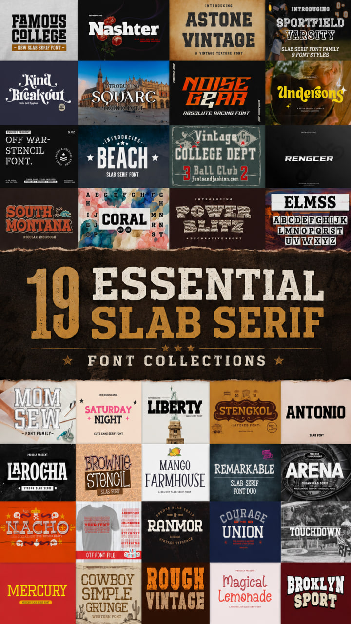
18 Best Slab Serif Font Picks: From Retro to Modern Excellence
Finding the right balance between old-school character and clean lines is the ultimate designer’s challenge. In this roundup, I’ve curated 18 essential picks to help you master everything from a rugged vintage slab serif aesthetic to a high-impact modern slab serif look. Whether your project demands the nostalgic soul of a retro slab serif or the polished authority of a contemporary typeface, these versatile fonts provide the structural strength and creative flair needed to anchor any professional layout.
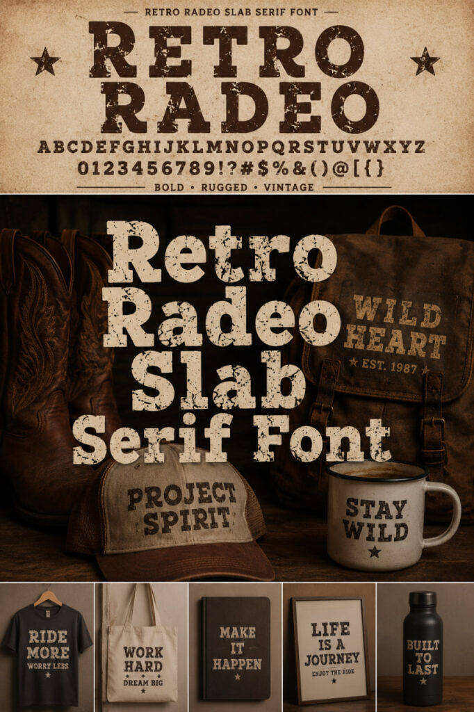
Retro Radeo Slab Serif Font


In my own design workflow, I’ve found this typeface to be a perfect choice for branding, rustic-themed posters, and even bold t-shirt designs. Its strong slab-serif foundation gives it a powerful and nostalgic visual impact that instantly grabs attention. Whether I’m working on a vintage-style logo or heavy-duty signage, Retro Radeo adds that timeless charm and gritty edge that modern, clean-cut fonts just can’t replicate. It’s definitely a unique tool to have in your kit when you need your creative work to speak with a bit of authority and history.
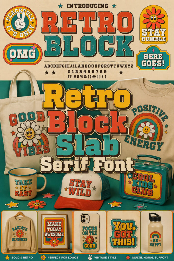
Retro Block Slab Serif Font
When I’m working on a branding project that needs a bit of personality without losing its professional edge, I often find myself browsing through various Slab Serif Fonts. Recently, I’ve been really impressed by Retro Block. It’s a fantastic retro slab font that feels tailor-made for things like logotypes, watermarks, and product packaging. What I love most is that every letter has a distinct, playful retro style design, which makes it perfect for promotions and posters that need to stand out. It’s a great example of how Slab Serif Fonts can be both sturdy and fun at the same time, giving any professional project a unique, nostalgic character.
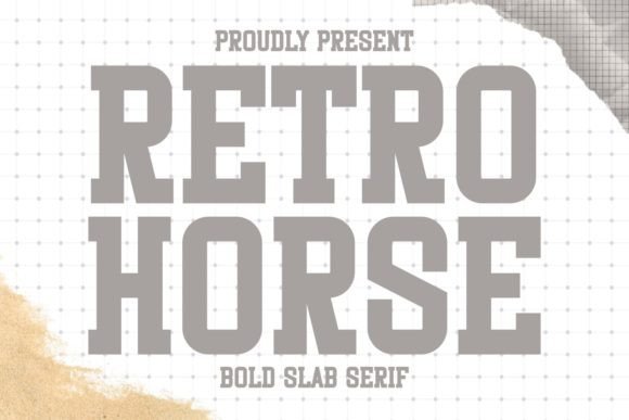
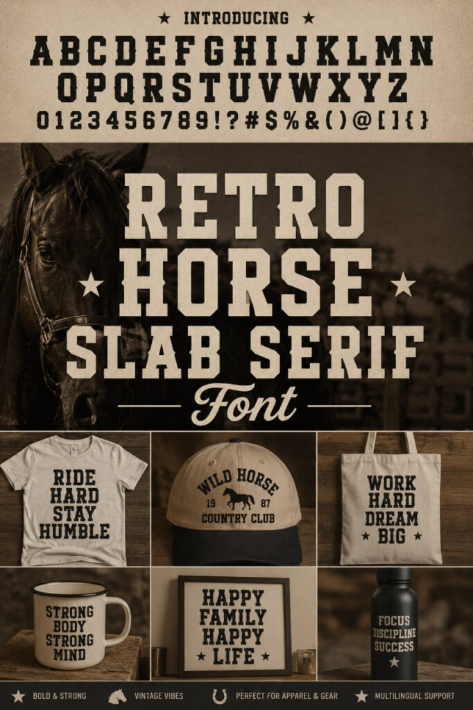
Retro Horse Slab Serif Font

If your project needs to feel professional but still keep a sense of humor, Retro Block is a fantastic discovery. I love how it reinvents the traditional structure of Slab Serif Fonts by giving every letter a playful, chunky design. It’s become a go-to for me when working on logotypes or promotional materials that need to pop without being too formal. Whether you’re designing watermarks or product packaging, this font brings a vibrant energy that proves “retro” doesn’t have to mean “stale”—it’s all about that bold, eye-catching personality.
Retro Soccer Slab Serif Font


Lately, I’ve been obsessed with finding typefaces that bridge the gap between “vintage stadium” and “modern streetwear,” and Retro Soccer hits that sweet spot perfectly. It’s a condensed take on the style, which is a breath of fresh air compared to the wider I usually see. The design has this bold, energetic pulse that feels like it’s straight off a retro jersey, but with a clean, modern finish that keeps it looking sharp on high-res digital backgrounds.
Retro Camera Slab Serif Font
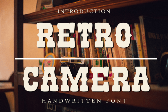

I’ve always felt that the right typography can act like a lens, focusing the entire mood of a design project. That is exactly what happens when I play around with Retro Camera. It’s a cool, Western-style typeface that stands out from more traditional Slab Serif Fonts by bringing a specific vintage charm that feels both nostalgic and fresh. I find myself reaching for this one whenever a layout needs a bit of rugged personality without becoming too heavy or overbearing.
Retro Grade Slab Serif Font
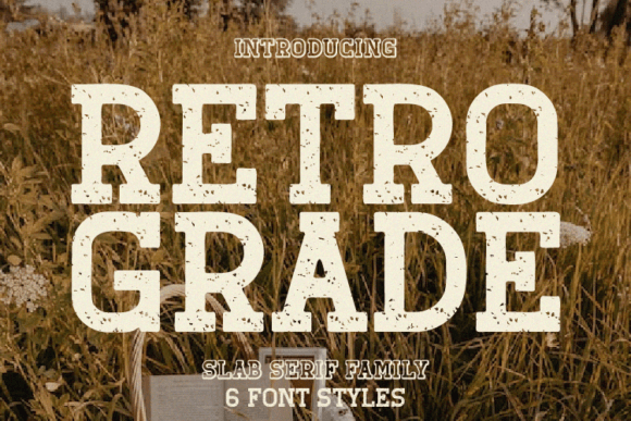

Sometimes a project just screams for a specific era, and Retro Grade is my go-to when I need to channel that distinct mid-20th-century aesthetic. While many Slab Serif Fonts can feel a bit too modern or industrial, this one has a sturdy, bold structure that feels like it was pulled straight from a vintage advertisement or an old-school storefront. It’s got a heavy presence that manages to feel nostalgic without being dated, which is a tricky balance to strike.
Vintage Christmas Slab Serif Font
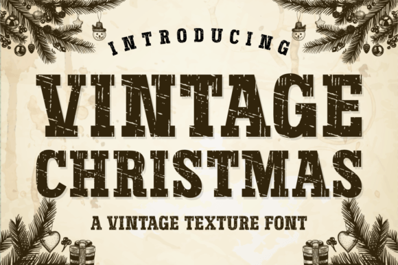

There is something truly magical about the way typography can evoke a specific memory, and Vintage Christmas is a perfect example of that. While I’ve worked with plenty of Fonts, this one stands out because it combines that sturdy, classic structure with a subtle texture that feels like a hand-printed card from decades ago. It’s not just a bold font; it’s an atmosphere. I’ve found that its textured finish adds a layer of warmth and sophistication that a standard, clean-cut typeface just can’t provide.
Old Typewriter Font


There is something deeply tactile about the click-clack of a vintage machine, and Old Typewriter captures that mechanical soul perfectly. When I’m sorting through my library of Fonts, I often look for options that break away from perfect geometry, and this “cute” thematic font does exactly that. It’s incredibly evocative of old mechanical type, giving any layout an instant retro or even a gritty “forensics” style that feels authentic and intentional.
Farmhouse Vintage Slab Serif Font
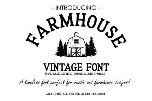
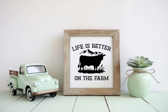
When a project calls for that cozy, “home-grown” aesthetic, Farmhouse Vintage is the first typeface I think of. It’s a beautiful departure from the more aggressive or industrial Fonts we often see, offering instead a soft, rustic serif look that feels incredibly grounded and approachable. There is something about its timeless charm that makes it feel like it belongs on a handcrafted wooden sign or a local artisan’s label.
Houston Vintage
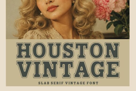

If you’re anything like me, you probably have a love-hate relationship with “rugged” typefaces—sometimes they’re just too messy to look professional. That’s exactly why Houston Vintage caught my eye. It’s one of those rare Fonts that manages to be undeniably bold and western-inspired while maintaining a polished, editorial elegance. It doesn’t just scream “cowboy”; it speaks with a refined, authoritative tone that I find incredibly useful for high-end branding and packaging.
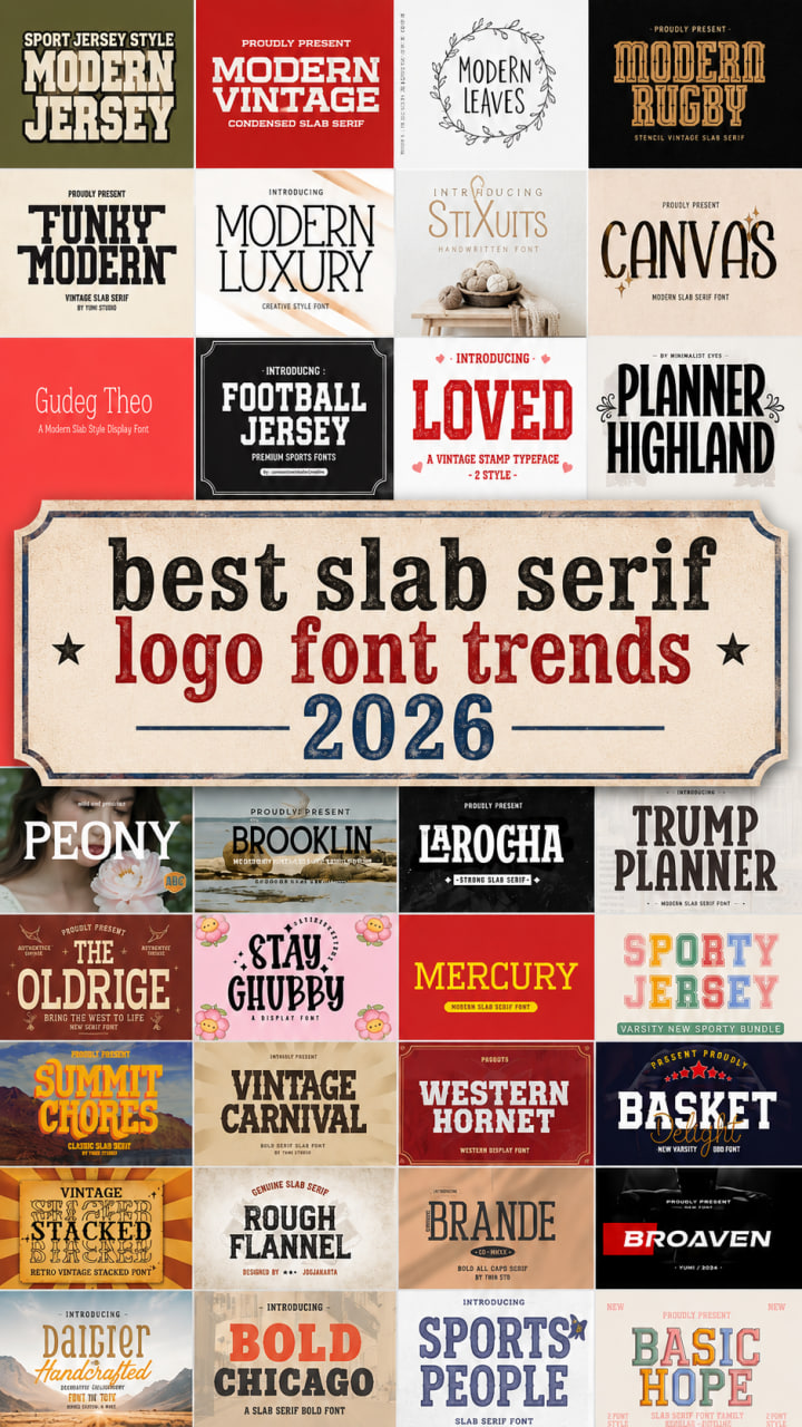
Bold Chicago Slab Serif Font
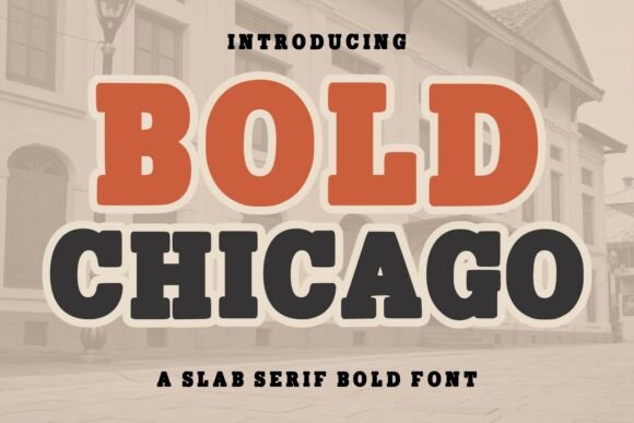

Walking through a city with history, you can’t help but notice the heavy, confident lettering on old brick warehouses and theater signs. Bold Chicago taps directly into that energy. While some Slab Serif Fonts try to be too clever with their curls and ornaments, this typeface stays true to a clean, powerful structure inspired by classic American typ
Modern Jersey
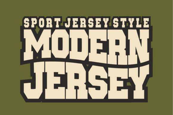

If you’ve ever looked at a varsity jacket or a professional sports jersey and wondered how to bottle that feeling of “game day” energy, Modern Jersey is the answer. It’s a standout choice among Slab Serif Fonts because it trades traditional vintage curls for a heavy, blocked structure and a distinctive arched baseline. This specific geometry immediately channels the spirit of competition and team unity that you see in professional athletic apparel and university-themed gear.
Modern Leaves Slab Serif Font


There’s something about a hand-drawn touch that instantly makes a layout feel more “human,” and Modern Leaves captures that vibe perfectly. While many Fonts can feel a bit rigid or overly industrial, this typeface breaks the mold with its unique, organic energy. It’s got that rare balance—sturdy enough to hold its own as a headline, but infused with a contemporary, artistic flair that gives your work a high-end editorial feel.
Modern Luxury Slab Serif Font


Sometimes I get tired of the “rough and tumble” look that dominates many Fonts, and that’s exactly when I pull out Modern Luxury. It is a stunningly stylish typeface that manages to feel incredibly solid without being bulky. What I find most interesting as a designer is the way it pairs bold, heavy letterforms with these surprisingly subtle, elegant serifs. It’s a masterclass in contrast, designed specifically for those high-end projects that demand a sharp, contemporary edge while still nodding to classic typographic charm.
Canvas Slab Serif Font

When a layout feels a bit thin or lacks “gravitas,” my secret weapon is often a font that isn’t afraid to take up space. Canvas fits that description perfectly. It’s a thick, modern take on the style that stands out from more delicate Slab Serif Fonts thanks to its impressively wide characters and chunky, unapologetic serifs. This isn’t a font meant to hide in the background; it’s designed specifically for those high-impact moments where you need your typography to be the main event.
Modern Rugby Slab Serif Font

I’m always on the hunt for a typeface that can handle a laser cutter just as well as a digital layout, and Modern Rugby is a total standout in that department. Unlike the standard “blocky” Slab Serif Fonts we see everywhere, this one brings a unique stencil aesthetic to the table. It has this incredible vintage vibe that reminds me of old-school gym gear, yet the execution is so precise that it feels perfectly at home in a sleek, professional portfolio.
Gudeg Theo Slab Serif Font


In my own design experiments, I’ve found that this font is a perfect match for things like playful packaging or custom greeting cards. It’s got a clean, modern structure that keeps it professional for branding, yet it’s soft enough for a heartfelt invitation or a lighthearted quote. If your current collection of Slab Serif Fonts feels a bit too rigid, adding Gudeg Theo to your toolkit is a great way to bring some charm and warmth to your creative layouts.
Apex Varsity Slab Serif Font


Apex Varsity is one of those Slab Serif Fonts that doesn’t just sit on a page—it dominates it. Inspired by the legendary lettering of college and varsity sports, it features a massive block structure and sharp cut details that give it a “championship” feel. It’s the kind of typeface that feels like it’s been stitched onto a heavy wool jacket or painted on a gymnasium wall.
If none of these Fonts quite hit the mark for your current project, don’t worry—design is all about the hunt! I have curated plenty of other specialized collections right here on my blog to help you find that specific vibe. Additionally, you can explore a massive variety of high-quality styles over on my partner’s site to discover the exact typeface you need.
- Check out more of my favorite vintage display fonts here
- Browse even more unique display fonts on my partner’s site