best slab serif logo font trends 2026
As we move into 2026, the demand for typefaces that balance digital precision with a grounded, physical presence has never been higher. Designers are increasingly turning to the Slab Serif logo Font to anchor brand identities, blending high-impact thickness with modern refinements like rounded terminals and expanded widths. Whether it’s the revival of gritty, vintage textures or the rise of ultra-sleek, condensed silhouettes, this year’s trends prove that the slab serif is no longer just for varsity jackets—it’s the definitive choice for brands looking to project both authority and contemporary edge.
College Block Slab Serif Font
When I’m diving into a project that requires a punchy, athletic vibe, I almost always lean into the structured world of Slab Serif logo Fonts. There’s just something about that heavy, blocked-out look that screams “heritage.” I’ve been playing around with the new College Block 2.0, and the upgrades are honestly a breath of fresh air for my workflow.

The first thing I noticed is the verticality—the letters are now roughly 30% taller, which gives them this commanding presence that’s just begging to be arched over a classic university sweater. It’s not just a simple stretch, though; several characters and European accents have been totally rebuilt from the ground up. What really sold me was the inclusion of Cyrillic and broader diacritic support, making it a much more versatile tool for my international projects. Whether I’m stitching together a new logo, a custom t-shirt line, or bold web graphics, this iteration of College Block brings that authentic collegiate energy into the modern design era.

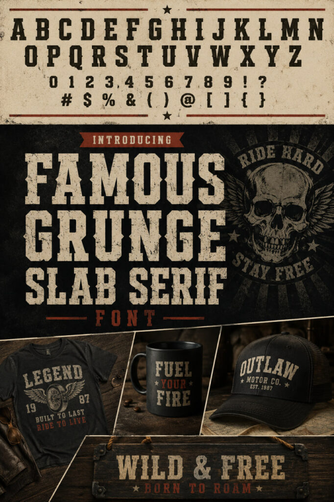
Famous Grunge slab serif logo Font
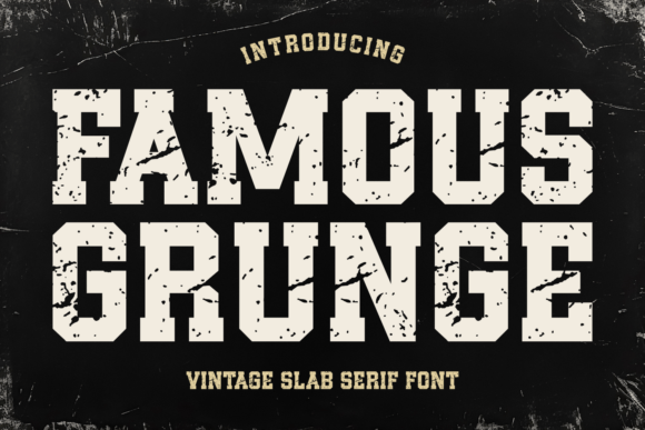

There’s a certain rebellious energy I look for when a project demands more than just basic structure, and Famous Grunge hits that sweet spot perfectly. While I usually rely on Slab Serif logo Fonts for their stability, this specific typeface adds a layer of grit that feels like a throwback to the analog vibes of the 70s through the 90s. It breaks away from the “too-perfect” look of traditional typography, offering a textured, weathered aesthetic that gives my designs an immediate sense of history.
Brande slab serif logo Font
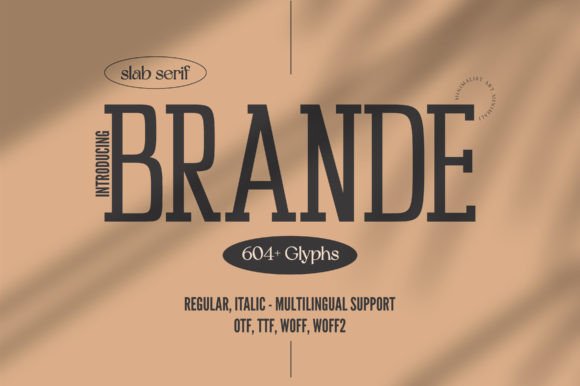

Lately, I’ve been moving away from the “heavy and rugged” look to explore the more sophisticated side of Slab Serif Fonts, and that is where Brande truly shines. It is a sleek, condensed typeface that completely redefines what a slab can be—swapping out industrial bulk for refined, tall proportions. When I first integrated it into a layout, I was struck by its minimalist poise; it carries a level of class that feels both contemporary and timeless.

Caprint slab serif logo Font


Sometimes a single typeface isn’t enough to tell a complete story, which is why I’ve been reaching for the Caprint trio lately. It’s a brilliant toolkit that pairs a bold, handcrafted Slab Serif Fonts option with a clean sans and a fluid script. For me, the standout is definitely the slab—it has this raw, organic texture that feels incredibly grounded. It’s the kind of font that looks like it was etched into a piece of wood or stamped onto leather, making it an absolute dream for any project with a “cowboy” or outdoor spirit.
Broaven slab serif logo Font
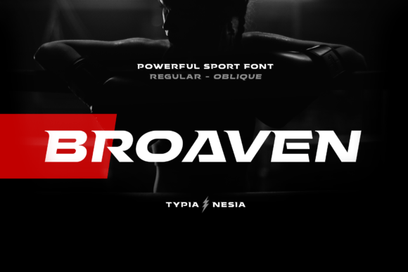
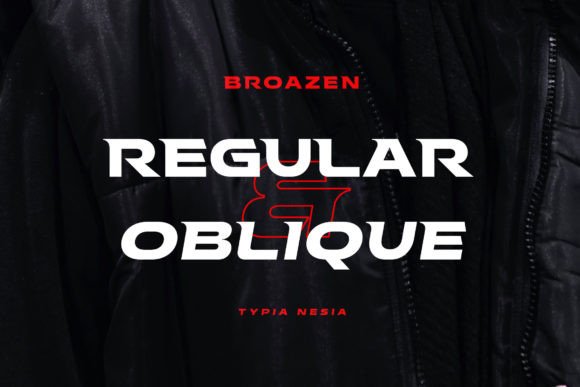
In my recent design explorations, I’ve found Broaven to be a powerhouse for fitness gym branding and gaming industry logos where you need that heavy, indestructible look. It’s not just for sports, though—I’ve used it for editorial headers and modern advertising where the typography needs to carry the weight of the entire layout. Whether I’m working on a music poster or a high-performance brand identity, this font brings a muscular, cinematic energy that elevates the visual narrative to a professional, high-octane level.
Mortberg slab serif logo Font

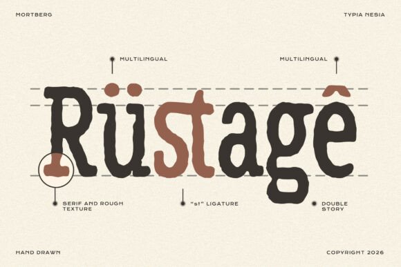
If there is one thing I love about working with Slab Serif , it’s their ability to ground a design, but Mortberg takes that stability and gives it a soul. This isn’t your typical clean-cut typeface; it’s a rough, hand-drawn slab that feels like it was pulled straight from a vintage workshop or a trail sign in the wilderness. The textured strokes and those intentional, “imperfect” details are exactly what I look for when a project needs to feel human, rugged, and lived-in.
Sporty Varsity slab serif logo Font

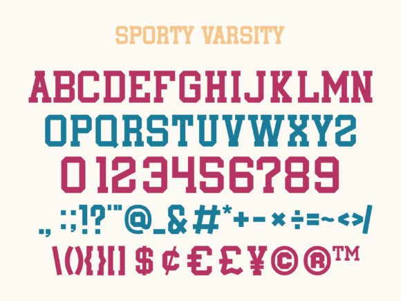
In my own creative experiments, I’ve found it’s surprisingly versatile beyond just team jerseys. It’s a fantastic choice for holiday branding or winter-themed projects where you want a sense of warmth and community. I’ve used it for everything from high-impact posters and t-shirt graphics to more intricate labels and product packaging. The thick, confident strokes make it an absolute winner for logos and quotes that need to stand out. If you are looking to inject some varsity-level confidence into your next project, this font is a solid playmaker.
Mercury slab serif logo Font

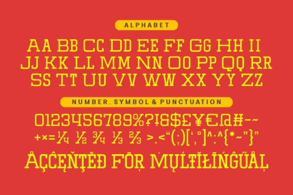
Whenever I need to tap into that nostalgic, high-energy American sports vibe, Mercury is one of those Slab Serif Fonts that immediately comes to mind. It’s got this robust, heavy-set design that feels like a direct throwback to the golden era of 80s and 90s varsity typography. When I look at its structure, I don’t just see letters; I see the bold spirit of college football and basketball jerseys. It perfectly bridges the gap between a gritty vintage aesthetic and the clean execution required for modern digital work.
Stay Chubby slab serif logo Font
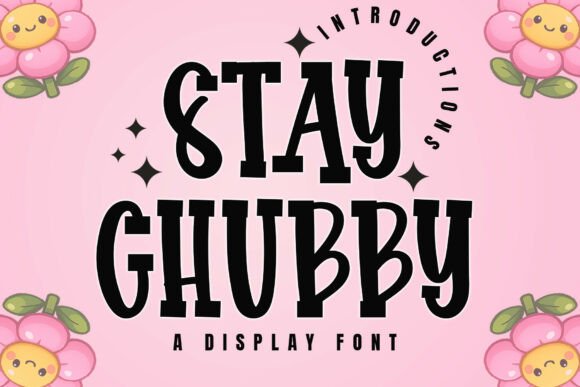
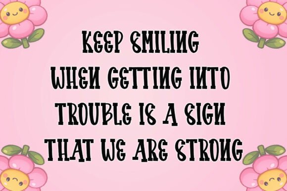
I usually turn to slab serif fonts when I need a design that looks solid and tough, but Stay Chubby has completely changed my perception of what this style can achieve. It manages to be massive and authoritative without feeling cold or industrial. Instead, it has this wonderful “hand-sculpted” quality—an organic geometry that feels more like clay than pixels. The soft, rounded ends take the aggressive edge off the traditional tile look, replacing it with a friendly, artisanal warmth that I’ve been craving more and more.
Brooklin slab serif logo Font
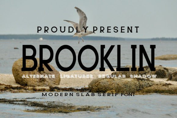

When I’m looking for a typeface that can pivot between high-fashion elegance and approachable branding, Brooklin is one of those Slab Serif Fonts that never lets me down. What makes it a standout in my collection is its dual personality; it features both a clean regular style and a striking shadow version that adds immediate depth to any layout. It manages to feel modern and “sweet” simultaneously, which is a rare find for a slab—giving me the flexibility to use it for everything from delicate wedding invitations to bold website headers.
Larocha slab serif logo Font
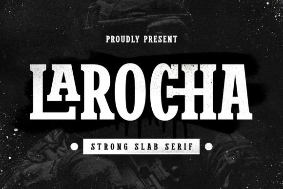
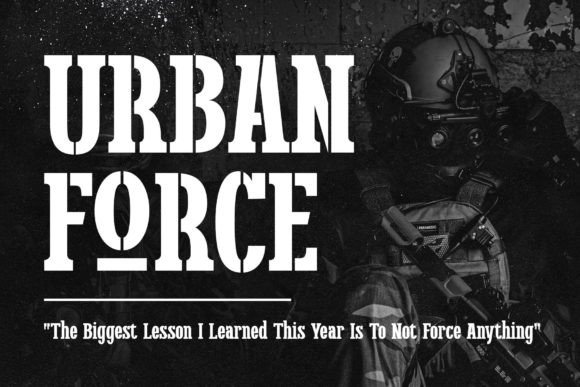
On the other hand, switching over to the stencil version totally changes the energy of my workspace. It’s my top pick for when I’m mocking up industrial-style signage, bold labels, or posters that need a bit of a utilitarian edge without looking too “heavy.” Having both styles within the same typeface family allows me to keep my branding projects cohesive while still having the freedom to play with different textures. Whether it’s a clean quote for a social feed or a rugged outdoor poster, Larocha brings a sophisticated touch to the slab serif aesthetic that I find myself returning to again and again.
Still Searching for the Ideal logo Font?
If none of these styles quite hit the mark for your project, don’t stress—I’ve curated several other specialized collections across my blog to help you find that perfect match. You can also head over to my partner’s site to browse an even wider selection of premium, high-impact typefaces tailored for any creative vision.
Explore more of my favorite fonts here
Discover a massive variety of unique fonts options on my partner’s site