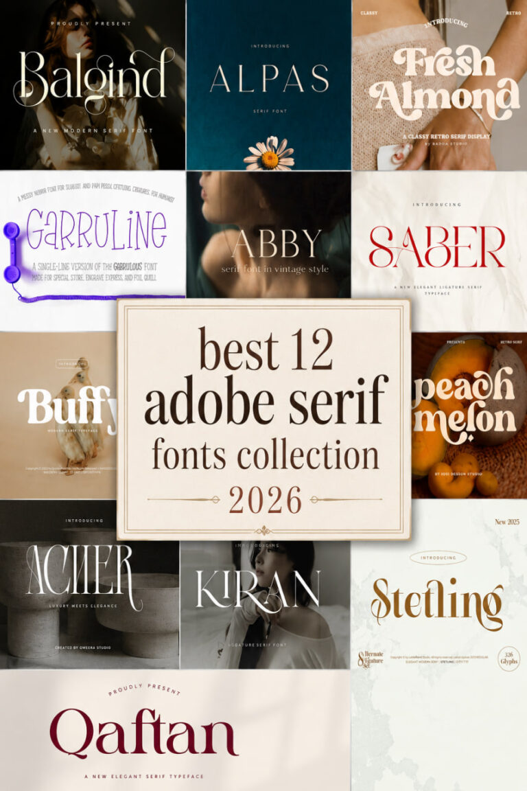
bold serif fonts collection 2026
Simple Bold Serif Font
Whether you are looking to refresh a brand identity or add some serious weight to your digital layouts, finding the perfect bold serif fonts collection 2026 is the best way to stay ahead of the curve. This year, the design world is leaning heavily into typography that balances traditional elegance with a raw, modern edge. As a designer, I’ve found that a strong serif isn’t just about readability—it’s about commanding attention and setting a specific mood, from gritty horror to high-end minimalism.
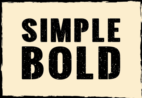
When I first started experimenting with this Serif Font, I wanted to bridge the gap between classic structure and a gritty, modern soul. In my personal projects, I often find that “clean” can sometimes feel a bit “sterile,” so I gave this typeface a raw, edgy aesthetic that brings immediate character to the page. By combining clean lines with heavy, bold strokes and a subtle grunge texture, I’ve created a look that feels both intentional and authentic.
Whether I’m stripping back a logo to its bare essentials or looking for a headline that actually demands a pause, this is my go-to choice. It’s all about that perfect equilibrium—the sophisticated DNA of a Serif Font paired with an unapologetic, bold presence. If you’re looking to elevate your visual content with something that strikes a balance between simplicity and power, this is how you make a statement.
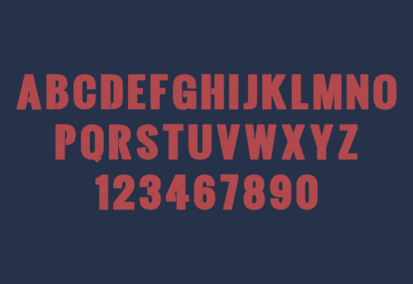
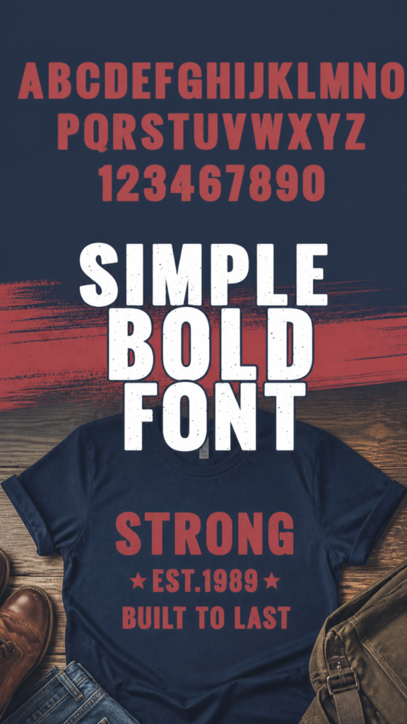
Bold Retro serif Font


When I’m looking to inject some serious soul into a project, I find myself reaching for this Serif Font time and time again. There’s something about its thick, confident strokes and those subtle flared terminals that feels like a love letter to mid-century cinema and classic advertising. As a designer, I love how it instantly grounds a layout with a sense of reliability and nostalgic warmth—it’s not just a typeface; it’s a mood. Whether I’m crafting a heavy-hitting logotype or a high-contrast editorial spread, this font provides the “heft” and personality that modern, thin designs often lack.
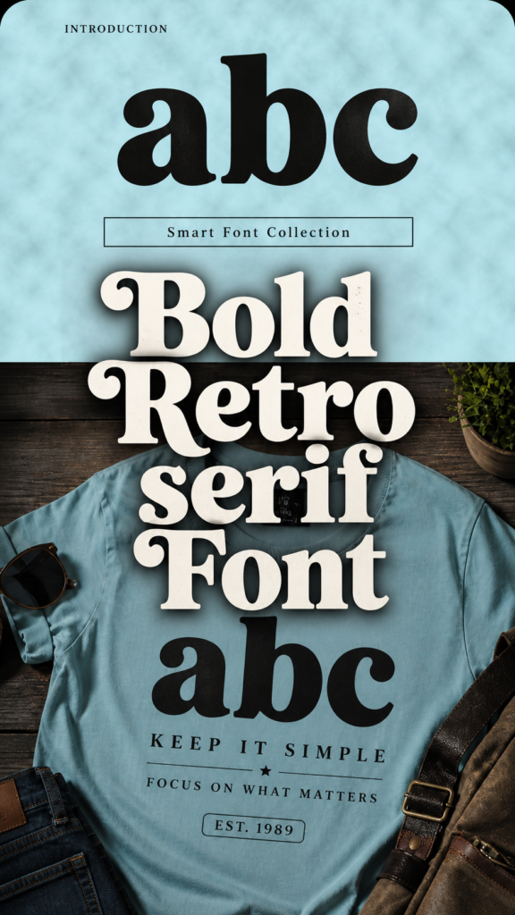
To get the most out of this Serif Font, I usually recommend one of two paths: either pair it with a clean sans-serif for a sophisticated, balanced look, or lean completely into the vintage vibe with grain textures and muted earth tones. It’s a powerhouse for logos, posters, and social media designs that need to stand out in a crowded digital landscape. More than just a decorative choice, it serves as a bridge between the timeless charm of the past and the high-definition demands of the future, giving your headlines the “heft” they deserve.
Bold Dignify Font
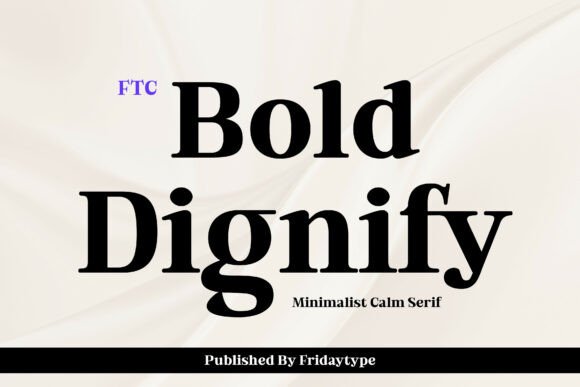

Finding a typeface that feels both authoritative and approachable is a rare win, which is why I’m currently obsessed with this specific Serif Font. It carries a bold, confident personality that I find perfect for those high-impact headlines that need to stand still and be noticed. What draws me to it as a designer is the clean, minimalistic approach; it manages to strike that elusive balance between a calm, sophisticated elegance and a truly charismatic strength.

In my recent projects, I’ve noticed that this Serif Font excels in modern editorial layouts and branding where clarity is just as important as visual presence. It’s become a go-to tool in my kit for whenever I need to convey a sense of authority without being overly loud or decorative. If you’re looking for a way to bring a touch of understated sophistication to your work while maintaining a powerful stance, Bold Dignify is exactly the kind of typeface that makes a statement through its refined simplicity.
Costaline Extra Bold serif Font


There’s something incredibly satisfying about finding a contemporary Serif Font that doesn’t lose its connection to classic elegance, and Costaline Extra Bold hits that mark perfectly. In my experience, it’s rare to find a typeface that feels so harmonious and stylish while remaining grounded in a traditional feel. What I love about this specific font is how it invites you to explore; between its vertical and italic styles, there are so many visual nuances and “hidden secrets” to uncover as you refine a layout.

I’ve found this Serif Font to be a powerhouse for a wide range of creative tasks, from high-end editorial designs and magazine titles to punchy advertisements. Because it balances a heavy weight with refined details, it works just as well for a minimalist logo as it does for long-form web design. It’s one of those versatile tools that I keep in my collection for branding projects that demand both a strong presence and a touch of modern flair.
Quickly Bold Serif Font


Every now and then, I stumble across a typeface that completely changes the energy of a canvas, and this playful design is a perfect example. While it carries the approachable soul of a bubble font, using it as a Serif Font alternative in my creative layouts adds a unique, handwritten charm that you just don’t get from standard typography. Its bold, friendly curves feel incredibly organic, making it my top pick for eye-catching headlines or posters where I want the brand to feel personal and full of life.
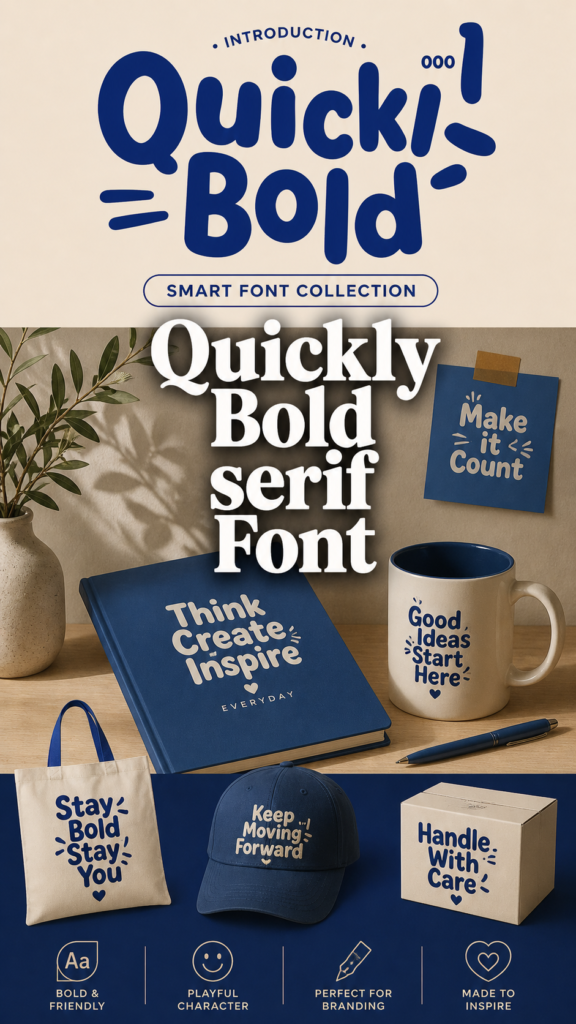
In my own design workflow, I love how this Serif Font style breaks away from the stiff formality of traditional type. It’s built for impact but refuses to take itself too seriously, which is ideal for social media graphics or any project that needs a burst of fun. If you are looking to inject some personality into your work, the bold strokes of Quickly Bold offer that rare mix of “loud” and “friendly” that helps a creative project truly stand out from the crowd.
Bold Rushaq Serif Font


Sometimes a project needs a little extra muscle to get the message across, and that’s exactly where this Serif Font comes into play. I love how Bold Rushaq combines a strong, heavy presence with surprisingly soft, rounded edges. It has these distinctive thick letters and charming little “tails” (the serifs) that really help each character stand out on the page rather than blending into the background.

Whenever I’m working on a layout that feels a bit flat, I find that swapping in a Serif Font with this much personality instantly makes the titles and headlines pop. It’s a fantastic choice for when you want your text to feel substantial and friendly at the same time. Whether it’s for a digital hero section or a printed poster, its bold construction ensures that your primary message is the first thing anyone notices.
Prominum Bold Serif Font


Every now and then, I come across a typeface that manages to break the mold of traditional typography, and Prominum Bold is definitely one of those finds. As a designer, I’m always on the lookout for a Serif Font that offers something beyond the standard “classy” look, and this one delivers with a really fun, modern twist. It features these interesting variations in its letterforms that can instantly bring a bit of magic or a romantic flair to a layout, making the design feel much more personal and evocative.

Whether I’m working on a branding project that needs a touch of whimsy or an editorial piece that requires an elegant yet unique header, this Serif Font provides a perfect balance of sophistication and playfulness. It’s a great example of how a bold, high-contrast typeface can still feel soft and inviting. If you’re looking to elevate your work with a font that feels both established and refreshingly creative, Prominum Bold is a fantastic choice to keep in your creative toolkit.
Rise Bold Serif Font

In my day-to-day design work, I’m often looking for that “Goldilocks” typeface—something that isn’t too loud but certainly isn’t invisible. Rise Bold is exactly that kind of Serif Font. It’s incredibly minimal yet carries a distinct air of elegance that makes it feel premium without trying too hard. The neat, simple characters are what really sell it for me; they provide a clean canvas that makes this font remarkably versatile across almost any project I throw it at.
Whether I’m working on a high-end branding identity or a simple lifestyle blog layout, this Serif Font fits into a wide pool of contexts with total ease. It’s the kind of reliable choice I keep in my favorites for when I need a design to feel structured and professional, yet light and modern. If you appreciate the “less is more” philosophy but still want the classic sophistication of a serif, Rise Bold is definitely a typeface worth exploring for your next creative endeavor.
Bold Horror Serif Font


There are times when a design needs to feel truly visceral, and that’s when I turn to a high-impact Serif Font like Bold Horror. It’s a heavy, dramatic display face that doesn’t just sit on the page—it haunts it. As a designer, I’m constantly impressed by how those thick strokes and sharp, jagged edges create an eerie vintage tone that feels pulled straight from a classic midnight movie. It’s my top recommendation for anyone working on horror posters, book covers, or spooky headlines where you need to deliver instant fear and intensity.

What makes this Serif Font so effective is its ability to maintain a massive visual impact regardless of size. Whether I’m using it for a large-scale movie title or a more compact album cover, its unsettling character always shines through. It strikes that perfect balance between vintage charm and raw, dark energy, making it a powerful choice for branding or social media projects that demand a gritty, supernatural vibe. If your next creative project needs to command attention with a sense of dread, Bold Horror is the ultimate tool to get the job done.
Bold Export One Serif Font

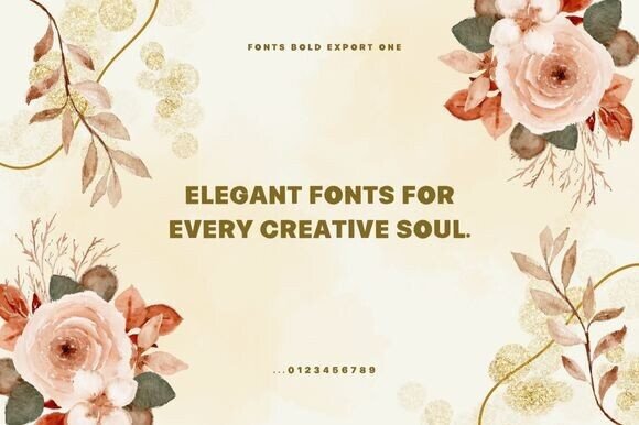
Finding a typeface that effectively balances a modern industrial vibe with high-impact power can be a challenge, but this Serif Font does exactly that. I love how Bold Export One utilizes a strong weight and clean edges to create a confident structure that feels both professional and edgy. In my own design work, I’ve found it to be a perfect choice for bold headlines, branding, and logos where I need the message to truly command the room.

One of the best things about this Serif Font is its sheer versatility; it transitions seamlessly between digital media and physical print, making it a reliable go-to for everything from editorial layouts to product labels and merchandise. Because it includes a full set of uppercase letters, numbers, and multilingual support, it is ready for just about any global project I’m tackling. Whether I’m aiming for an unforgettable poster or a sharp piece of signage, this font provides that specific “punch” and clarity that ensures the design stands out in a crowded landscape.
Wrapping up, it’s clear that the right typeface can completely transform the energy of a design, whether you’re going for a vintage vibe or a sharp, industrial look. I hope this bold serif fonts collection 2026 helps you find that perfect balance of weight and character for your upcoming projects. If you didn’t find exactly what you were looking for here or just want to expand your creative toolkit even further, feel free to check out more fonts at this link to discover a wider variety of styles that will help your work stand out. Check out more of my favorite serif fonts here.