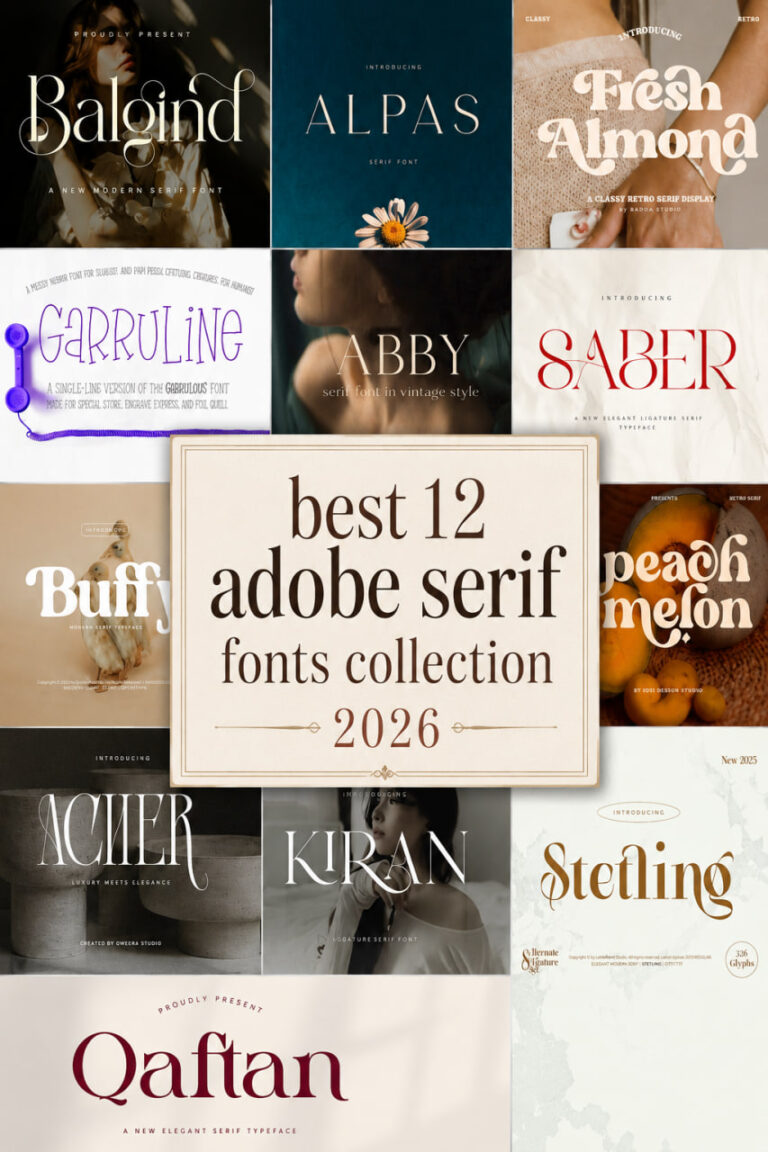
Top 16 Modern Wedding Serif Fonts for a Luxury Aesthetic
In this curated list, I’m sharing my top 16 wedding serif fonts that perfectly blend modern sophistication with timeless charm. From razor-sharp editorial styles to delicate, ornament-filled scripts, these selections are designed to elevate your invitations, branding, and stationery to a truly professional, luxury aesthetic.
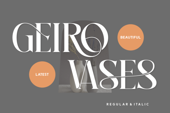
Wedding Destiny serif Font

When I first came across the Wedding Destiny serif font, I immediately knew it was going to be a staple in my design toolkit. As someone who spends hours hunting for the perfect typography, I’ve found that many serif fonts can feel a bit too stiff or corporate for intimate projects. This one, however, is a total breath of fresh air. It’s a vintage-inspired cursive typeface that radiates warmth and a touch of nostalgic romance, making it feel less like a digital asset and more like a cherished heirloom.

In my own design practice, I’ve found that the true charm of this typeface lies in its ability to soften a layout while maintaining a high level of sophistication. It is particularly effective for wedding stationery, organic food labels, and feminine lifestyle branding where you want to evoke a sense of elegance without being unapproachable. I love enhancing its vintage feel by pairing it with delicate botanical illustrations or muted, earthy color palettes. Because it strikes such a beautiful balance between casual and formal, it has also become my go-to choice for “thank you” cards and boutique logos where a human, approachable touch is the secret to truly connecting with a customer.
Winter Wedding Serif Font

As a designer, I’m always on the hunt for serif fonts that can instantly set a specific mood without requiring hours of extra illustration work. That is exactly why I fell in love with the Winter Wedding typeface. It is a stunning, formal font adorned with a flurry of exquisite snowflakes, effectively bringing a touch of high-end elegance to any winter-themed layout. It manages to transform standard text into a literal winter wonderland, creating a picturesque and sophisticated atmosphere that feels both magical and professionally polished.

In my recent projects, I’ve found that this font is the ultimate “secret weapon” for creating a beautiful and cohesive seasonal aesthetic. Whether I’m working on high-end wedding invitations, holiday cards, or editorial spreads, the delicate snowflake embellishments add a layer of detail that feels incredibly intentional. If you are looking for serif fonts that bridge the gap between traditional formality and festive charm, this is the one to reach for—it’s perfect for those special occasions where you want your typography to tell a story all on its own.
Wedding Serif Font


Lately, I’ve been finding myself reaching for the Wedding serif font whenever a project calls for something truly special. As a designer, you quickly learn that not all serif fonts are created equal; some feel too rigid, while others lose their professional edge. This particular typeface, however, strikes that perfect, elusive balance. It is an authentic serif with a distinctly romantic touch, expertly designed to feel both timeless and fresh. In my experience, it has this unique potential to take a creative concept from “good” to “extraordinary” just by its presence on the page.

I really consider this font to be a true favorite for any high-level design work. Whether I’m mocking up a luxury brand identity or fine-tuning a layout for a client, the Wedding serif font brings a level of sophistication that is hard to match. It doesn’t just sit there—it actively enhances the atmosphere of the design. If you’re looking to push your creative ideas to the highest level, I can’t recommend this one enough; it’s one of those essential serif fonts that instantly makes everything look more polished and intentional.
Black Mogan Serif Font


When I’m working on a high-end branding project, I often find that standard serif fonts can feel a bit too traditional for a contemporary audience. That’s where Black Mogan comes in—it’s a stunningly modern serif that feels incredibly fresh and versatile. What I personally love about this typeface is the inclusion of unique alternates and ligatures. These subtle details allow me to customize a logo or a headline so it feels truly bespoke, making it a perfect fit for everything from edgy t-shirt designs and posters to high-end photography watermarks and inspirational quotes.
In my design workflow, the Black Mogan serif font serves as the ultimate “all-rounder” for display creations. While it has the sharp, clean lines required for a professional corporate identity, it also carries an elegance that is well-suited for more delicate work, like wedding invitation cards. It has this rare ability to look both trendy and timeless at the same time. If you are looking to elevate your creative toolkit with serif fonts that offer a bit more personality and flair, Black Mogan is definitely a choice that will help you take your branding materials to the next level.
Orchid Serif Font
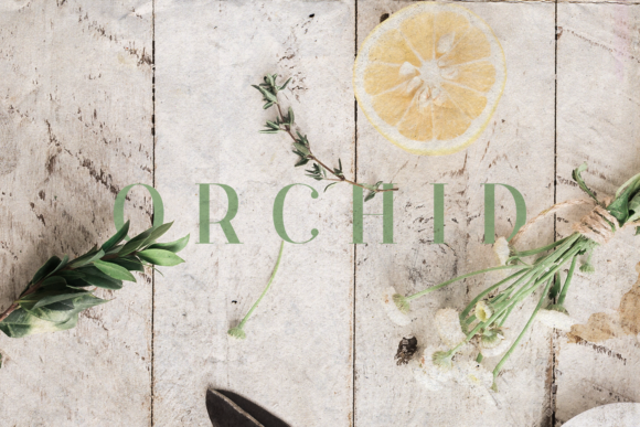

In my daily design routine, I’m always searching for serif fonts that manage to look expensive without being overly complicated. I recently started playing around with the Orchid font, and it is honestly such an elegant and delicate choice. It has this incredibly versatile style that makes it a dream to work with; whether I’m mocking up gorgeous wedding invitations or experimenting with some beautiful stationary art, it just seems to fit the mood perfectly. It’s one of those rare finds that feels both high-end and deeply approachable.
What I love most about Orchid is how well it translates across different mediums. Beyond print, I’ve found it to be a fantastic option for eye-catching social media posts where you want a bit of “quiet luxury” to stand out in a busy feed. If you are curating a collection of serif fonts that can handle everything from feminine branding to sophisticated editorial layouts, Orchid is a must-have. It’s become a real favorite of mine for any project that needs a soft, refined touch to truly shine.
Seraphim Serif Font
In my journey as a designer, I’ve found that the best serif fonts are those that manage to evoke a specific emotion the moment they hit the canvas. The Seraphim typeface is a perfect example of this—it’s a refined serif inspired by classic beauty but balanced with a very modern sense of elegance. What sets it apart for me are the high-contrast strokes and those ethereal, graceful curves. Each letterform feels like it has been carefully shaped to provide a sense of softness and sophistication, giving any project a almost “divine” presence that is hard to replicate with more standard typefaces.


I’ve personally found Seraphim to be an absolute dream for editorial layouts and fashion branding, where you really want the typography to feel as high-end as the imagery. It’s also an incredible choice for beauty packaging or those aesthetic Instagram quotes that need to feel light and airy yet expensive. If your design library is missing serif fonts that bridge the gap between timeless tradition and a soft, modern aesthetic, Seraphim is definitely one you’ll want to keep at the top of your list for your next special occasion or luxury brand project.
Silkydusk Serif Font


As a designer who leans toward a “less is more” philosophy, I am always on the lookout for serif fonts that can carry a brand’s entire identity through typography alone. Silkydusk is exactly that—a luxury minimal serif that feels like the height of modern beauty. What caught my eye immediately were the smooth curves and those incredibly graceful alternates and ligatures. It’s a typeface crafted for those of us who value timeless sophistication, offering a refined look that doesn’t need to shout to be heard.
In my recent workflow, I’ve found Silkydusk to be surprisingly versatile. While it’s a natural fit for high-end logo designs and fashion magazines, its balanced proportions mean it works just as beautifully for delicate packaging or wedding invitations. Whether I’m using it for a bold, impactful headline or more refined body text, it delivers a consistent level of class. If you’re looking to add a sense of “quiet luxury” to your toolkit, Silkydusk is definitely one of those serif fonts that will stay in your rotation for years to come.
Savage Roses Serif Font

Every now and then, I stumble upon serif fonts that completely change the energy of a mood board, and “Savage Roses” is definitely one of them. It is a breathtaking typeface that manages to strike a rare chord between bold modernism and romantic sentiment. What I love about it is how it manages to be cheerful and lively—almost adorable—while still keeping that sophisticated edge we all look for in high-end design. It’s the kind of font that evokes instant joy, making it a fantastic pick for everything from heartfelt wedding invitations to playful birthday cards and branding materials.
In my experience, the true “magic” of this font lies in its unique, delicate curls. These little flourishes add a touch of enchantment to logos and packaging, helping your typography stand out in crowded fields like fashion and photography. Whether I’m using it to make a quote pop on a magazine page or designing a book cover that needs to feel alive, “Savage Roses” consistently delivers that eye-catching, authentic feel. If you’re tired of serif fonts that feel a bit too static, this one will truly make your words bloom with life and personality.
Desevon Serif Font


When I’m looking to inject a sense of exclusivity into a project, I find myself gravitating toward the Desevon typeface. As a designer, you quickly realize that the best serif fonts are the ones that honor classic typography while feeling completely at home in a modern layout. Desevon does exactly that—it’s a refined and elegant serif characterized by high-contrast strokes and luxurious ligatures that instantly elevate the visual hierarchy of a page. What I personally love about working with this font are the stunning stylistic alternates and delicate swashes; they flow so effortlessly that every word ends up feeling like a custom piece of lettering rather than just another standard font choice.
In my own design practice, I’ve found Desevon to be a powerhouse for versatility, successfully balancing classic charm with a sharp, modern finesse. It has become one of my top recommendations for high-end branding and fashion editorials where you need that “expensive” look without the clutter. Whether I’m designing a sleek logo for a skincare brand or setting the type for a luxury wedding invitation, this font delivers a polished, professional finish every time. If you’re curating a collection of serif fonts that can handle everything from Pinterest content to high-end product packaging, Desevon is a sophisticated must-have that will never go out of style.
Aretha Serif Font


In the world of high-end design, we are always looking for serif fonts that can tell a story before the reader even processes the words. That is precisely why I’ve been so drawn to Aretha lately. It’s a modern ligature serif that feels like it was plucked straight from the pages of a luxury fashion editorial. The real magic happens in the contrast; youhave these razor-sharp serifs paired with lyrical, sweeping ligatures that weave characters together like fine jewelry. It creates a sophisticated rhythm on the page that feels both cutting-edge and timelessly expensive.
From a practical design perspective, I consider Aretha a “hero” typeface, especially when I’m working within the fashion and beauty industries. Its generous x-height ensures that even with those delicate, artistic connections, the text remains perfectly legible and impactful. I’ve found it to be the ultimate choice for elevating a visual identity, as it brings a sense of curated luxury to any layout. If you’re building a library of serif fonts that need to communicate prestige and elegance, Aretha is an absolute standout that will make your designs feel truly bespoke.
Abigale Serif Font


When I’m looking for serif fonts that offer more than just a standard set of characters, Abigale is usually at the top of my list. As a designer, I see it as a masterclass in fluid design and sophistication. What makes it a standout choice for my projects is the sheer level of customization it offers; with over 50 alternate characters and stunning ligatures, I can tweak a headline or a logo until it feels like a bespoke piece of art. The combination of graceful, sweeping curves and those crisp, sharp serifs creates a high-end look that is incredibly hard to ignore.
In my recent editorial work and boutique packaging designs, I’ve found that Abigale does a beautiful job of weaving a story of timeless elegance. It’s my go-to when a client needs luxury fashion branding or upscale wedding stationery that feels both modern and classic. Because of its fluid connections, it doesn’t just display text—it gives it a sense of movement and prestige. If you are curating a collection of serif fonts that allow for a truly unique, “tailor-made” aesthetic, Abigale is a powerful tool to have in your design arsenal.
Zacorsea Serif Font
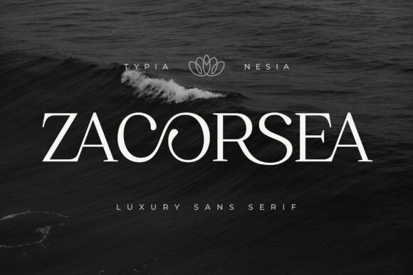
Lately, I’ve been obsessed with how the right typography can completely shift a brand’s energy, and the Zacorsea typeface is a perfect example of that power. As a designer, I’m constantly looking for serif fonts that go beyond basic structure to express a sense of timeless beauty and royal sophistication. Zacorsea is a modern luxury serif that feels incredibly polished; its graceful curves and refined letterforms are specifically crafted to deliver that high-end aesthetic we all crave for premium projects. What really sets it apart for me are the beautifully crafted ligatures, which blend modern elegance with a soft, feminine touch that feels both exclusive and approachable.
In my own studio, I’ve found Zacorsea to be an absolute dream for beauty branding and luxury logos. Whether I’m working on skincare packaging or a high-fashion label, this font brings a level of “classy” that is hard to find in more standard serif fonts. It’s also a fantastic choice for wedding invitations or posters where you need a touch of modern beauty to stand out. If you’re trying to build a visual identity that feels expensive and intentionally curated, Zacorsea is the kind of typeface that does the heavy lifting for you, ensuring every design looks like it belongs on the shelf of a high-end boutique.
Grache Hustle Serif Font


When I’m scrolling through my font library looking for something that perfectly captures that “beauty aesthetic,” I find that many serif fonts either feel too heavy or a bit too dated. That’s exactly why I’ve fallen in love with Grache Hustle lately. It is a stunning typeface that manages to blend soft femininity with a very specific kind of luxurious elegance. Every letterform feels like it was crafted with a sense of charm and romance in mind, making it a dream for any project that requires high-end visual storytelling. Those graceful curves and refined details provide a timeless appeal that instantly makes a layout feel more expensive and intentional.
In my recent design work, I’ve found that Grache Hustle really shines when it’s used for fashion branding or beauty product packaging. There is an artistic, premium touch to this font that elevates everything from luxury logos to editorial layouts. Whether I’m working on delicate wedding invitations or curating a sophisticated social media feed for a lifestyle brand, it delivers a polished and romantic vibe that is hard to beat. If you are on the hunt for serif fonts that bring a sense of effortless beauty and “quiet luxury” to your toolkit, Grache Hustle is definitely a typeface you need to experiment with.
Morside Serif Font


I’ve always believed that a designer’s choice of typography is their most powerful tool for setting a project’s tone, and lately, Morside has been my go-to for making a real statement. Unlike some serif fonts that can feel a bit stuck in the past, Morside is a refined modern serif that perfectly bridges the gap between timeless elegance and contemporary sophistication. What I personally love about this typeface is the high-contrast strokes and those incredibly graceful curves—they give my layouts a luxurious, artistic impression that feels both classic and surprisingly fresh.
In my own design practice, I find Morside to be incredibly versatile. Whether I’m working on high-end fashion visuals, magazine layouts, or luxury packaging, it brings a sense of class and confidence that’s hard to ignore. It’s particularly effective for wedding designs or boutique labels where you need a look that says “refined style” without trying too hard. If you’re looking to update your library with serif fonts that command attention through subtle details rather than loud flourishes, Morside is a typeface you absolutely need to try.
Artia Duo Serif Font


Whenever I’m tasked with a project that needs to scream “upscale,” I find myself reaching for the Artia Duo. As a designer, there is nothing quite like finding a font pairing that works perfectly right out of the box, and this exquisite combination of high-contrast serif fonts and sophisticated italic calligraphy is a total game-changer. The way the timeless serif elegance plays off those ornamental ligatures and humanist proportions creates a sense of classic refinement that feels very much at home in the modern world. It’s the kind of pairing that makes a personal brand or a boutique business feel established and high-end the moment it hits the screen.
In my recent work with luxury packaging and wine labels, I’ve found that these versatile serif fonts do all the heavy lifting for me. Whether I’m designing a complex corporate identity or a minimalist wedding invitation, the Artia Duo delivers a polished, cohesive look that is hard to achieve by manually matching different typefaces. I particularly love using it for fashion projects and jewelry branding where every detail needs to feel intentional. If you are looking to create stunning displays—from menus to contemporary editorial layouts—this duo is a fantastic addition to your toolkit for that perfect blend of modern sophistication and heritage charm.
Monarch Heritage Serif Font


When I’m looking for serif fonts that can carry the weight of a high-end editorial project, Monarch Heritage is usually the first one I pull from my library. It’s an elegant, modern display serif that feels incredibly refined, balancing sharp contrast with graceful curves in a way that just screams luxury. As a designer, I love how it brings a sense of timelessness to the canvas; it doesn’t just sit there, it actually elevates the entire visual narrative. Whether I’m mocking up a creative portfolio or a fashion-forward poster, this typeface provides that polished, professional edge that makes a design look like it belongs in a premium gallery.
What makes Monarch Heritage a real standout in the crowded world of serif fonts is its dynamic pairing of Regular and Italic styles. I’ve found that using the italics for magazine titles or premium branding adds a level of sophisticated movement that you can’t get from more static fonts. It’s also become one of my favorite choices for wedding designs and high-end packaging because it feels so exclusive. If you’re trying to create a typographic experience that feels both high-end and deeply intentional, this is definitely a font that should be at the heart of your design toolkit.
Still Haven’t Found Your “The One”?
If none of these wedding serif fonts quite hit the mark for your specific vision, don’t worry! I’ve curated several other collections here on the blog to help you find that missing piece.
You can also head over to my partner’s site, which hosts a massive library of high-quality styles for even more professional options.